8 min read
How to build a button with Next.js and shadcn/ui
Bharat Kilaru
Buttons can be a tricky component to build. They have multiple variants and states that need to be accounted for. In this tutorial, we're going to build a button with multiple variants and states using Next.js and shadcn/ui.
What is shadcn/ui?
shadcn/ui is a great set of React components built with Radix UI and Tailwind CSS. The best part is that it's open source code that you can bring into your own projects rather than reyling on an additional package.
This makes it great not only to quickly build out your own components, but also to learn from the source code!
Set up Next.js
-
Let's start by creating a new Next.js app using the Next.js CLI
npx create-next-app next-button-app --ts -
The latest version of the Next.js CLI will ask you some setup questions. You can choose your personal preference, but for the sake of the tutorial, we'll use most of the defaults except for app directory (press
return)✔ Would you like to use ESLint with this project? … Yes ✔ Would you like to use `src/` directory with this project? … No ? Would you like to use experimental `app/` directory with this project? › Yes ✔ What import alias would you like configured? … @/*Note that we're using the experimental
app/directory as our default for projects -
Change directories to your new app
cd next-button-app
Install Tailwind CSS
-
Install Tailwind CSS dependencies
npm install -D tailwindcss postcss autoprefixer -
Create a new file called
tailwind.config.jsin the root of your projecttouch tailwind.config.js -
Add the following to
tailwind.config.jsmodule.exports = { darkMode: ["class", '[data-theme="dark"]'], content: ["app/**/*.{ts,tsx}", "components/**/*.{ts,tsx}"], theme: { extend: {}, }, variants: { extend: {}, }, plugins: [], };
Note that we're using the
app/directory as our default for projects so we're adding that to thecontentarray.
Note that other shadcn/ui components involve adding additional plugs (e.g.
tailwindcss-animate)
Class Variance Authority
Class Variance Authority (CVA) is a library that allows you to create components with multiple variants and states. It's a great way to build components that are flexible and reusable.
-
Install additional dependencies
npm install class-variance-authority
clsx and tailwind-merge
clsx is a utility for constructing className strings conditionally.
tailwind-merge is a utility for merging Tailwind CSS classes together.
shadcn/ui recommends we use them together to create a helper function that will merge Tailwind CSS classes together conditionally.
-
Create a lib folder in the root of your project
mkdir lib -
Add a
utils.tsfile to thelibfoldertouch lib/utils.ts -
Add the following to
lib/utils.tsimport { ClassValue, clsx } from "clsx"; import { twMerge } from "tailwind-merge"; export function cn(...inputs: ClassValue[]) { return twMerge(clsx(inputs)); }Now we can use
cnto merge Tailwind CSS classes together conditionally.
Using Lucide icons for the spinner
Lucide is a set of open source icons. We're going to use Lucide icons for the spinner.
Check them out here: https://lucide.dev/
-
Install Lucide icons
npm install @lucide/react
You can use any icon library you want, but we're using Lucide for this tutorial. You can also create your own custom spinner component with the following component:
import cn from "@/lib/cn";

type SpinnerProps = {
  className?: string;
  size?: "small" | "medium" | "large";
};

export default function Spinner({ className, size = "medium" }: SpinnerProps) {
  return (
    <div role="status" className={className}>
      <svg
        aria-hidden="true"
        className={cn("animate-spin fill-white text-gray-200", {
          "h-4 w-4": size === "small",
          "h-8 w-8": size === "medium",
          "h-12 w-12": size === "large",
        })}
        viewBox="0 0 100 101"
        fill="none"
        xmlns="http://www.w3.org/2000/svg"
      >
        <path
          d="M100 50.5908C100 78.2051 77.6142 100.591 50 100.591C22.3858 100.591 0 78.2051 0 50.5908C0 22.9766 22.3858 0.59082 50 0.59082C77.6142 0.59082 100 22.9766 100 50.5908ZM9.08144 50.5908C9.08144 73.1895 27.4013 91.5094 50 91.5094C72.5987 91.5094 90.9186 73.1895 90.9186 50.5908C90.9186 27.9921 72.5987 9.67226 50 9.67226C27.4013 9.67226 9.08144 27.9921 9.08144 50.5908Z"
          fill="currentColor"
        />
        <path
          d="M93.9676 39.0409C96.393 38.4038 97.8624 35.9116 97.0079 33.5539C95.2932 28.8227 92.871 24.3692 89.8167 20.348C85.8452 15.1192 80.8826 10.7238 75.2124 7.41289C69.5422 4.10194 63.2754 1.94025 56.7698 1.05124C51.7666 0.367541 46.6976 0.446843 41.7345 1.27873C39.2613 1.69328 37.813 4.19778 38.4501 6.62326C39.0873 9.04874 41.5694 10.4717 44.0505 10.1071C47.8511 9.54855 51.7191 9.52689 55.5402 10.0491C60.8642 10.7766 65.9928 12.5457 70.6331 15.2552C75.2735 17.9648 79.3347 21.5619 82.5849 25.841C84.9175 28.9121 86.7997 32.2913 88.1811 35.8758C89.083 38.2158 91.5421 39.6781 93.9676 39.0409Z"
          fill="currentFill"
        />
      </svg>
      <span className="sr-only">Loading...</span>
    </div>
  );
}Create a button component
-
Create a
componentsfolder in the root of your projectmkdir components -
Create a
Buttoncomponent file in thecomponentsfoldertouch components/Button.tsx -
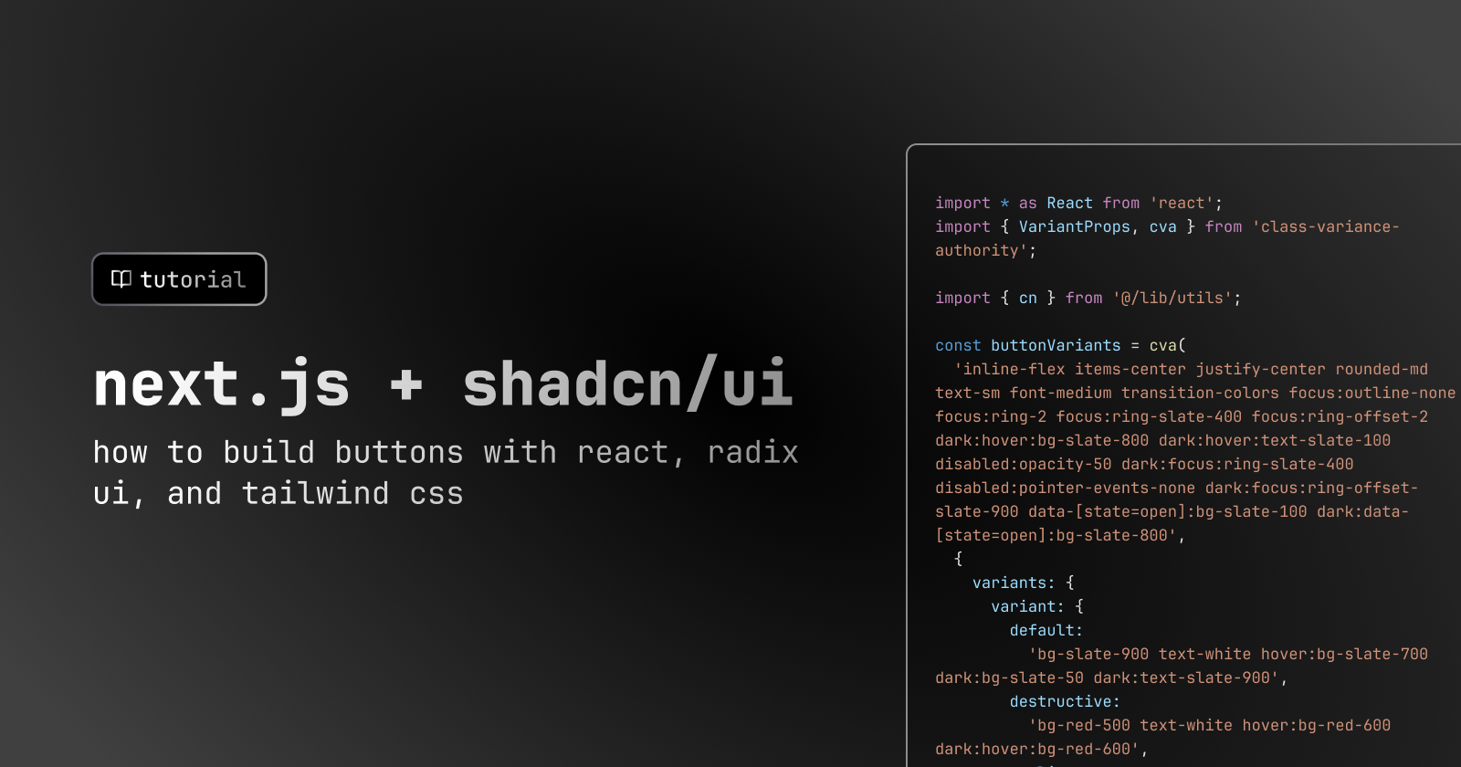
Add the following to
components/Button.tsximport * as React from "react"; import { VariantProps, cva } from "class-variance-authority"; import { cn } from "@/lib/utils"; const buttonVariants = cva( "inline-flex items-center justify-center rounded-md text-sm font-medium transition-colors focus:outline-none focus:ring-2 focus:ring-slate-400 focus:ring-offset-2 dark:hover:bg-slate-800 dark:hover:text-slate-100 disabled:opacity-50 dark:focus:ring-slate-400 disabled:pointer-events-none dark:focus:ring-offset-slate-900 data-[state=open]:bg-slate-100 dark:data-[state=open]:bg-slate-800", { variants: { variant: { default: "bg-slate-900 text-white hover:bg-slate-700 dark:bg-slate-50 dark:text-slate-900", destructive: "bg-red-500 text-white hover:bg-red-600 dark:hover:bg-red-600", outline: "bg-transparent border border-slate-200 hover:bg-slate-100 dark:border-slate-700 dark:text-slate-100", subtle: "bg-slate-100 text-slate-900 hover:bg-slate-200 dark:bg-slate-700 dark:text-slate-100", ghost: "bg-transparent hover:bg-slate-100 dark:hover:bg-slate-800 dark:text-slate-100 dark:hover:text-slate-100 data-[state=open]:bg-transparent dark:data-[state=open]:bg-transparent", link: "bg-transparent underline-offset-4 hover:underline text-slate-900 dark:text-slate-100 hover:bg-transparent dark:hover:bg-transparent", }, size: { default: "h-10 py-2 px-4", sm: "h-9 px-2 rounded-md", lg: "h-11 px-8 rounded-md", }, }, defaultVariants: { variant: "default", size: "default", }, } ); export interface ButtonProps extends React.ButtonHTMLAttributes<HTMLButtonElement>, VariantProps<typeof buttonVariants> {} const Button = React.forwardRef<HTMLButtonElement, ButtonProps>( ({ className, variant, size, ...props }, ref) => { return ( <button className={cn(buttonVariants({ variant, size, className }))} ref={ref} {...props} /> ); } ); Button.displayName = "Button"; export { Button, buttonVariants };
How does this work?
shadcn has created multiple variants for the button here - including default, destructive, outline, subtle, ghost, and link. Each of these variants is set up with specific tailwind classes that will be applied to the button.
All of these variants are built on top of the core button set of tailwind classes
The VariantProps type from CVA is used to ensure that the variant and size props are typed correctly.
Now you can easily import the Button component and use it in your app.
Create a form component
-
Create a
Formcomponent file in thecomponentsfoldertouch components/Form.tsx -
Add the following to
components/Form.tsximport * as React from "react"; export default function Form() { const [isLoading, setIsLoading] = React.useState<boolean>(false); return ( <form onSubmit={handleSubmit(onSubmit)}> <div> <button className={cn(buttonVariants())} disabled={isLoading}> {isLoading && ( <Icons.spinner className="mr-2 h-4 w-4 animate-spin" /> )} My New Button! </button> </div> </form> ); }
Conclusion
In this tutorial, we used Next.js + shadcn/ui to create a button component
Resources
Acknowledgements
Thanks to Bharat Kilaru for writing this tutorial. Thanks to Harish Kilaru and Yogi Seetharaman for editing and reviewing. If you have any questions, feel free to reach out to them on Twitter. Thanks to GitHub Copilot and ChatGPT for helping write, edit, and proofread parts of this tutorial.
Neorepo
This tutorial is part of Neorepo - we are building starter kits for building full-stack apps with Next.js. We'd love for you to buy a kit and join our community of builders, where we help each other build cool new apps with the latest tech stacks.
Neorepo is a production-ready SaaS boilerplate
Skip the tedious parts of building auth, org management, payments, and emails
See the demo
© 2023 Roadtrip